

Digitising a 'personal touch' experience

Client: Govindas
Timeframe: 2 weeks
Problem: Govindas would like to extend their personal touch service to their mobile responsive website.
Solution: By refining the navigation, emphasising the call-to-action and adding 'personal touch' elements to the design, Govindas will be able to enhance their customer’s digital experience.
Skills and techniques:
+ Stakeholder Interview + Personas & Scenarios + Survey analysis
+ Competitor comparison + Customer Journey Maps + MoSCoW Graph
+ Information Architecture + Wire framing Interface + Design & Iterations

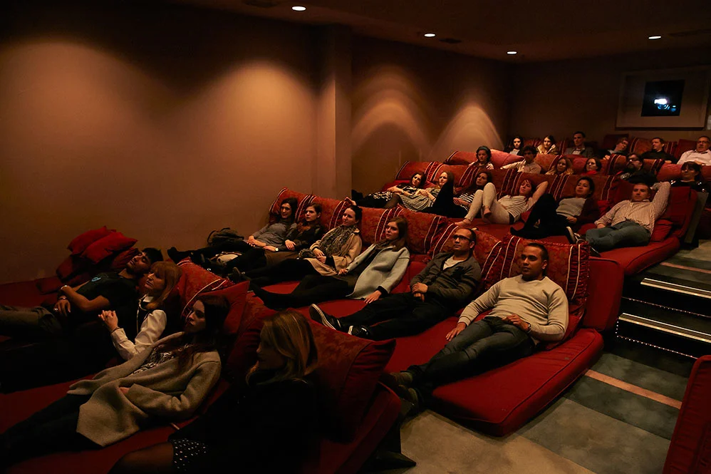

Current website and mobile responsive design
Overview
Our brief was to research a small business and identify specific business problems. We created personas and scenarios, then presented our findings and digital design solution to the client.
The first hurdle was choosing a business. One teammate wanted to work with a charity. The other had an an extensive hospitality background, and was keen to work with a business in that field.
I suggested Govindas, a non-for-profit restaurant and cinema room. With everyone on board, I reached out to the owner/director of Govindas, Tony Kaye.
Although Govindas is NFP, Tony expressed interest in growing his customer base. He was considering refreshing his website for desktop and smart phone, and was keen to see what our research would uncover.
We agreed that we would conduct preliminary research on Govindas and it's customers. We would identify a problem area around his current website and suggest solutions.
KEY FINDINGS FROM INTERVIEW WITH TONY
+ Govindas was established to connect, not to profit.
+ They pride themselves on their 'personal touch' service.
+ Although owned by the Hari Krishnas, they weren't interested in promoting their religion. It was there as an option to explore if a patron desired.
Tony also offered some insights on his customers.
1. “People come here for the personal touch service. An escape from their busy working lives. We get a lot of professionals. Mostly women. 24-39."
2. “Govindas started with a restaurant, then we added the cinema room. But the cinema ended up being more popular.”
3. "We get a lot of group bookings, a few dates. People using coupon deals that we do for marketing”.

Phase 1 - Research.
We wanted to confirm and Tony’s assumptions about his clientele, to ensure we would develop the new website for the right audience.
We conducted a site visit and also developed a survey. We sent it out to Sydney-based participants, and discovered 3 key findings:
1. The majority of people aged 25 - 40 prefer to book restaurants over the phone, rather than online.
2. When looking at restaurants on their mobile devices, people want specific, brief information.
3. The ‘About’ section for restaurants/cinema’s was as important as viewing a menu. People like to stalk places online before visiting.
We then completed a competitive comparison to establish industry trends. We also looked to identify revenue streams, cost structure and customer relationships. And also to potentially “borrow“ ideas.


We developed three key personas using information from Tony and our survey results. Each persona also had a corresponding scenario. This activity informed the Customer Journey Map. The map was a great way of identifying customer's pain points. It also highlighted opportunities for improvements, to make their experience more enjoyable.
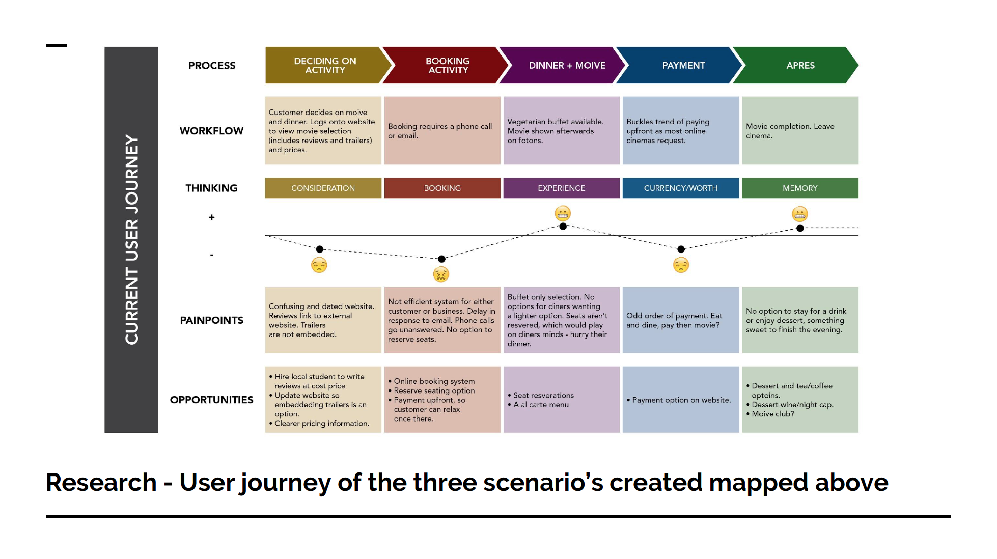
Customer Journey Map


Following the research section of our assignment, our goal for Govindas was now clear. Diners liked to book restaurants on the go using their phones (usually after some preliminary research). Tony wanted to offer his guests a personal-touch service throughout their entire interaction with Govindas. Therefore:
PROBLEM STATEMENT Govindas would like to extend their personal touch service across their mobile responsive website.
SOLUTION STATEMENT By refining the navigation and call-to-action and by adding 'personal touch’ features, Gonvidas will be able to enhance their customer’s digital experience.
DESIGN HYPOTHESIS After revisiting our notes from the our interview with Tony, we found a quote that surmised our design hypothesis:

Phase 2- Responsive Mobile Design
We were able to determine the minimum viable product features using a MoSCoW map. The MVP had to include a menu, clear and filterable movie times, an 'About' section, and a clear and obvious phone booking system.

Wireframes
Wireframes
I created our first wire frames, placing our MVPs into the design with a basic navigation system. Some user testing revealed a number of flaws. Including the booking system, lack of imagery and no clear directions on how to book.

Iteration 1
Iteration 1
In the first design we had introduced a step-by-step booking system. However user testing revealed that people felt they were being set up to book online, only to find out they had to call.

Iteration 2
Iteration 2
We addressed the booking system for Iteration 2 by making the 'Call to Book' button more prominent. More user testing revealed that the branding was overwhelming. The logo was appearing on every page and a lack of imagery made user feel unengaged.

Final design
Final design
The final design presents a simplified navigation with relevant content only. This allows Govindas' customers to view the cinema timetable, menu and the 'about' section, with an option to book at any stage. The CTA is obvious, floating at the bottom of each screen.
Overview
The Govindas brief was a good example of combining customer and business wants and needs.
Govindas pride themselves on a personal touch - they want people to call to make a booking, to have that personal interaction. Our research showed that customers prefer to call restaurants to make a booking. The real crux was removing any hurdles in that process.
By simplifying their responsive website, Govindas maintain their personal touch while the user is able to enjoy a streamlined experience. Everybody wins!