

Designing a friendly guide and helping hand

Client: Sarah Keast (fellow GA student)
Timeframe: 1 week
Problem: Sarah wants to negotiate insurance, legal and emotional fields following an unexpected accident.
Solution: A friendly yet systematic and trackable guide to pursuing her claims and help along her healing.
Skills and techniques:
+ User Interview + Storyboarding + Competitor Analysis + User Journey Mapping
+ Usability Testing + Wireframe designs + User Interface Design
Sarah's story...
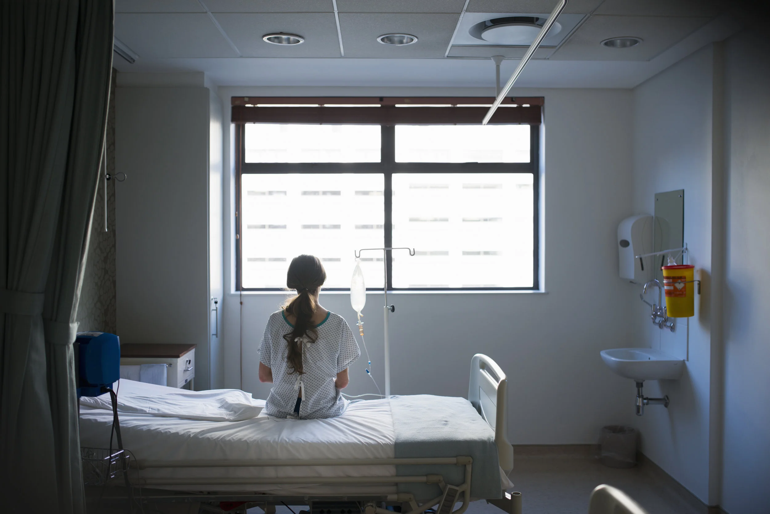
Returning from a yoga class one ideal Monday evening, Sarah was involved in a road accident. This accident involved Sarah, her Vespa and an oncoming car. The car turned out in front of her. They collided. The driver got out, looked at Sarah lying unconscious on the street, got back in her car and drove away. One onlooker called an ambulance, another onlooker stole money from Sarah's wallet. She was taken to hospital soon after.
What followed was a series of operations and medical bills, police reports and court proceedings, insurance claims and hundreds of forms. Not to mention the twelve weeks in bed - cut off from work, family and friends. Waiting for her body to heal.
Overview
I’m not sure about you, but I can’t even begin to comprehend an experience like Sarah's. Let alone, while recovering in hospital - being handed numerous forms and claim applications. She had little to no information as to how and when to lodge them, and about the huge process that follows.
When Sarah briefed me on this project, I have to say I was a little bit overwhelmed. Overwhelmed by her incredible story and overwhelmed with the prospect of designing something to help her – where would I even begin? Then it occurred to me that, that’s exactly how she would have been feeling. Sitting in her hospital bed. Completely overwhelmed. It was easy to empathise with her.
So just like Sarah, I started from the top.
Phase 1 - Research.
User Interview - I spoke with Sarah both casually (me sitting there, shocked and in awe of her story) and then formally. Following our initial casual chat - I was able formulate a series of questions to ask her to help me fully understand her situation, and how to help her on her journey.
I then developed a storyboard, keeping in close contact so she could review and make amendments.
I also did a quick competitor analysis of her favourite apps and asked her what exactly she likes about each app. I knew it would be great to have these insights in my back pocket for later use on wireframes.
KEY FINDINGS
+ Forms. Insurance forms have a strict time frame of when they must be lodged or they become redundant.
+ Documentation. Overwhelming number of documents to keep in an orderly file.
+ Numbers. Numerous pins and various claim numbers that are frequently required.
+ Confusion. There's no 'How-to' guide following an accident, you left to work it out yourself. It's easy to loose track where you're at with each institution - police, lawyers, hospital, health insurance etc.
+ Alone. Isolating experience. No support networks, or lists of professionals that specialise in this area.
Phase 2 - Design.
I began designing the UI of Sarah's app with a brain dump. In creating the first designs I kept in mind her pain points, function and features from her favourite apps and new elements I thought would enhance her user journey.
I tested these paper wireframes on a number of people, making iterations before then showing the first draft to Sarah.
When creating the high-fidelity wireframes I considered her love of even numbers, her minimalist style, and the aesthetics of the apps and website she enjoys.
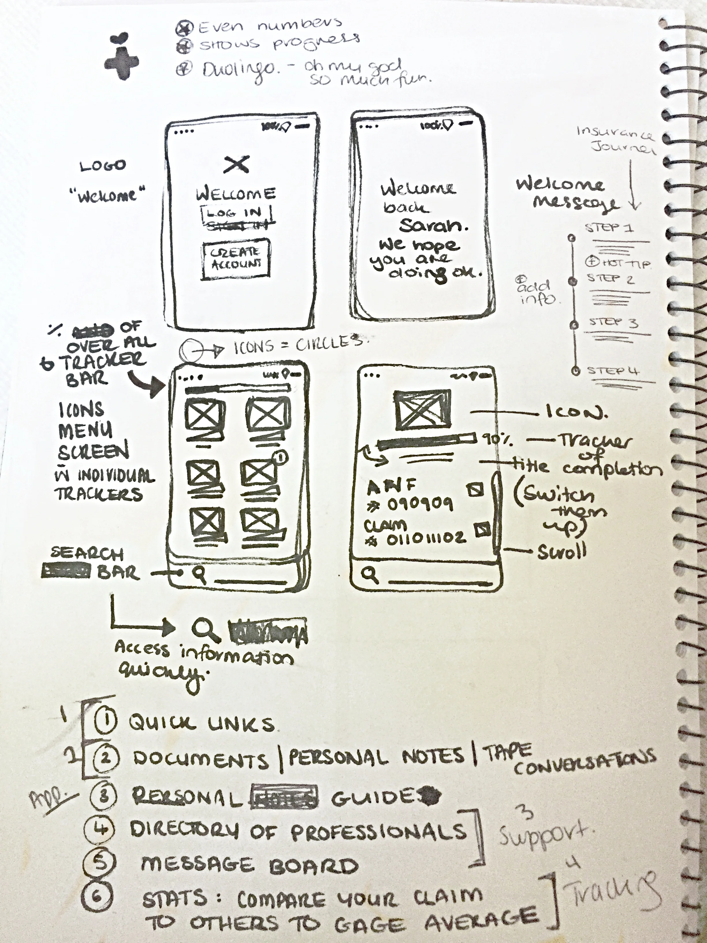
Brain Dump

Iteration #1

Final Wireframes

Final Wireframes
Key features.
+ Warm colour & language. Sarah mentioned that she felt like she needed a "kind and understanding friend" to guide her through this process. I used warm and inviting colours rather than more traditional medical blues and greens. I also wanted the language throughout to be colloquial and gentle, as if a close friend or relation was guiding her.
+ Guided timeline. The timeline was influenced by the HeadSpace App. You can easily see how long each process will take.
+ Tracker. The tracking element was inspired by Duolingo. Once you complete one task you then unlock the next. Making the process less daunting by tackling one step at a time.
+ Fast Information. Important claim numbers, pins etc are easily accessible.
+ Documents, sorted into folders. PDFs or phone camera images of important documents can be saved and stored in labeled folders. Creating an on-hand, digital filing system so she doesn't have to stress about paper work.
In conclusion
SUMMARY
This app was a journey for us both. But it was also a privilege. I don’t think I’ve worked on a design in my career where I’ve cared so much about helping the client.
LEARNINGS
1. Touching base with the client as much as possible clears issues and hurdles up quickly. They are the expert.
2. I learned to appreciate a good brain dump. It helps to get ideas and assumptions out. That's also where you can begin to see the riddles and the patterns.
3. Witnessing an idea generate from concept to design is awesome.